通过使用 Flutter 构建 BW丨BBS 的静态页面,详细介绍 Flutter 的核心组件。
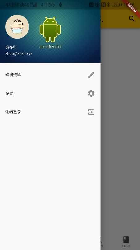
drawer app

核心组件

首先新建一个 Flutter 项目,可以看到下面的代码:

1
void main() => runApp(MyApp());

这是程序的入口处,顺着程序的入口 MyApp 就可以看到遇到的第一个核心组件 MaterialApp

MaterialApp

MaterialApp 表示为一个使用 Material 界面风格的应用程序,它封装了应用程序实现 Material Design 所需要的一些 widget,大多数项目的界面都应该基于 MaterialApp 进行呈现。

该组件三个属性的基本用法如下:

1
2
3
4
5
6
7
8
MaterialApp(
// 应用程序的标题
title: 'BlackWalnut Labs.丨BBS',
// 应用程序的主题
theme: ThemeData(primarySwatch: Colors.amber),
// 应用程序的主界面
home: Text('BlackWalnut Labs.丨BBS'),
)

home 属性指定程序的主界面,如果直接指定 Text 则为整个界面都为文字。但是在实际开发过程中不仅仅是显示文字,还会有顶部栏、主体、底部栏或者侧边栏的划分,并且显示的内容可能还会改变,这就需要用到需要认识的第二个核心组件 Scaffold

Scaffold

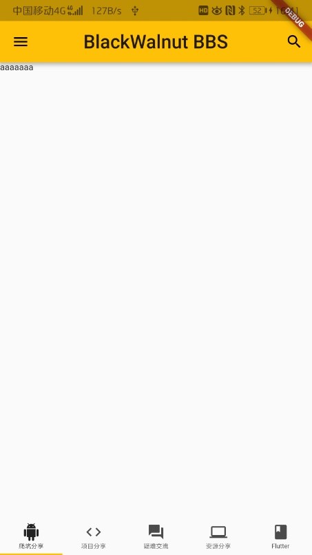
该组件是页面结构的脚手架,包含了页面的基本组成单元:

appBar —— 头部导航条区域

components_toolbars

appBar 属性使用需要传入一个 AppBar 组件:

1
2
3
4
5
6
7
8
9
10
11
12
13
14
15
16
Scaffold(
appBar: AppBar(
title: Text(
"BlackWlnute BBS.",
style: TextStyle(fontSize: 30),
),
centerTitle: true,
actions: <Widget>[
IconButton(
icon: Icon(Icons.search),
onPressed: () {
print("onPressed search");
}),
],
),

  • title 属性传入一个 Text 组件作为 appBar 显示的内容;

  • centerTitle 属性传入的是一个布尔值,控制内容是否居中显示;

  • actions 属性指定右侧的行为按钮,传入了一个 IconButton 组件,这个组件传入 icon 作为显示的图标, onPressed 表示点击触发的事件。

drawer —— 侧边栏抽屉区域

patterns_navigation_drawer

侧边栏抽屉区域,用法比较简洁,主要代码示例如下:

1
2
3
4
5
6
7
8
drawer: Drawer(
// 抽屉可能在高度上超出屏幕,所以使用 ListView 组件包裹起来,实现纵向滚动效果
child: ListView(
// 干掉顶部灰色区域
padding: EdgeInsets.all(0),
// 所有抽屉中的子组件都定义到这里:
children: <Widget>[],
))

Drawer 组件中,通过 child 传入一个 ListView 组件。这个组件相当于把自己 children 中得到的组件作为一个列表排列。列表的第一项传入 UserAccountsDrawerHeader 用来展示用户信息,之后使用 ListTile 展示选项和 icon,示例代码如下:

1
2
3
4
5
6
7
8
9
10
11
12
13
14
15
16
17
18
19
20
21
22
23
24
25
26
27
28
29
30
31
32
33
34
35
36
37
38
39
40
drawer: Drawer(
child: ListView(
padding: EdgeInsets.all(0),
children: <Widget>[
UserAccountsDrawerHeader(
accountEmail: Text(
"zhou@zhzh.xyz",
style: TextStyle(color: Colors.white),
),
accountName: Text(
"诌在行",
style: TextStyle(color: Colors.white),
),
currentAccountPicture: CircleAvatar(
backgroundImage: NetworkImage(
'https://cn.bing.com/th?id=OIP.fLI-fIeiAEMZwLhz6KkcMQAAAA&pid=Api&rs=1&p=0'),
),
decoration: BoxDecoration(
image: DecorationImage(
image: NetworkImage(
'https://www.geekinsider.com/wp-content/uploads/2015/02/8795800-android-background.jpg'),
fit: BoxFit.cover)),
),
ListTile(
title: Text("编辑资料"),
trailing: Icon(Icons.edit),
),
ListTile(
title: Text("设置"),
trailing: Icon(Icons.settings),
),
ListTile(
title: Text(
"注销登录",
),
trailing: Icon(Icons.exit_to_app),
)
],
),
),
ListView

滚动列表,可以很单纯中填充固定个数的内容,也可以循环渲染列表数据。将需要的内容节点,直接写入到 ListView 组件的 children 属性中即可,代码示例如下:

1
2
3
4
5
6
7
8
9
10
11
12
13
ListView(
children: <Widget>[
ListTile(
title: Text('我要发布'),
trailing: Icon(Icons.send),
),
Divider(),
ListTile(
title: Text('注销'),
trailing: Icon(Icons.exit_to_app),
)
]
)
CircleAvatar

组件表示把图片按照圆形展示,然后通过自己的 backgroundImage 属性传入一个 NetworkImage 组件,这个组件用来通过地址加载网络上的图片;

UserAccountsDrawerHeader

一般都用在侧边栏 Drawer 组件中:其中, accountNameaccountEmail 是必选项。另外,头像区域使用 currentAccountPicture 进行指定;背景区域使用 decoration 属性进行指定;

组件这里还用到了一个属性 decoration,很多组件都有这个属性,这个属性是用来美化当前控件的,这里通过这个属性给头像区域加图片。首先传入一个 BoxDecoration 组件,然后给它的 image 属性传入图片,这里直接传入是不可以的,需要传入的是 DecorationImage 组件。然后在 DecorationImage 组件中指定 image。正常显示图片后会发现如果侧边栏的尺寸和导航栏尺寸不一致的话会有留白的情况,通过给 fit 属性指定 BoxFit.cover 使得图片填充整个组件所在的区域;

详细代码示例如下:

1
2
3
4
5
6
7
8
9
10
11
12
13
14
15
16
17
18
19
UserAccountsDrawerHeader(
accountEmail: Text(
"zhou@zhzh.xyz",
style: TextStyle(color: Colors.white),
),
accountName: Text(
"诌在行",
style: TextStyle(color: Colors.white),
),
currentAccountPicture: CircleAvatar(
backgroundImage: NetworkImage(
'https://cn.bing.com/th?id=OIP.fLI-fIeiAEMZwLhz6KkcMQAAAA&pid=Api&rs=1&p=0'),
),
decoration: BoxDecoration(
image: DecorationImage(
image: NetworkImage(
'https://www.geekinsider.com/wp-content/uploads/2015/02/8795800-android-background.jpg'),
fit: BoxFit.cover)),
),
padding

这个属性用来控制边距。这里通过使用 EdgeInsets.all(0) 来消除侧边栏顶部的那一行空白。

bottomNavigationBar —— 底部 tabBar 区域

components_bottom_navigation

1
2
3
4
5
6
7
8
9
10
11
12
13
14
15
16
17
18
19
20
21
22
23
24
25
26
27
28
bottomNavigationBar: Container(
height: 50,
child: TabBar(
labelStyle: TextStyle(height: 0, fontSize: 10),
tabs: <Widget>[
Tab(
icon: Icon(Icons.android),
text: '爬坑分享',
),
Tab(
icon: Icon(Icons.code),
text: '项目分享',
),
Tab(
icon: Icon(Icons.question_answer),
text: '疑难交流',
),
Tab(
icon: Icon(Icons.computer),
text: '资源分享',
),
Tab(
icon: Icon(Icons.book),
text: 'Flutter',
),
],
)
),
Container

一个常用的布局组件,常用的属性:

  • child【子节点】

  • padding【内容距离盒子边界的距离】

1
padding: EdgeInsets.all(10)
  • margin 【盒子边界之外的距离】
1
margin: EdgeInsets.all(10)
  • decoration【盒子的装饰】
1
2
3
decoration: BoxDecoration(
color: Colors.red,
border: Border(bottom: BorderSide(width: 5, color: Colors.cyan)))

body —— 页面主体内容区域

1
2
3
body: Center(
child: Text('Hello World!'),
),

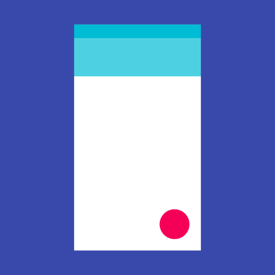
floatingActionButton —— 右下角浮动按钮区域

虽在这个 Codelabs 中没有用到 floatingActionButton,但是这个属性依旧是 Scaffold 中重要的属性,它控制的是右下角浮动按钮区域

components_buttons_fab

在记录点击次数这个经典示例中,使用示例代码如下:

1
2
3
4
5
6
7
8
9
10
11
12
13
14
15
16
17
int _count = 0;

Widget build(BuildContext context) {
return Scaffold(
bottomNavigationBar: BottomAppBar(
child: Container(height: 50.0,),
),
floatingActionButton: FloatingActionButton(
onPressed: () => setState(() {
_count++;
}),
tooltip: 'Increment Counter',
child: Icon(Icons.add),
),
floatingActionButtonLocation: FloatingActionButtonLocation.centerDocked,
);
}

StatefulWidget 自定义有状态组件

StatefulWidget 是有状态控件,这样的控件拥有自己的私有数据和业务逻辑,基本定义过程如下:

定义有状态的控件

1
2
3
4
5
6
7
8
9
10
11
12
13
// 定义一个 电影详情 控件,继承自 StatefulWidget
class MovieDetail extends StatefulWidget {
// 构造函数,初始化当前组件必须的 id 属性
MovieDetail({Key key, @required this.id}) : super(key: key);

// 电影的Id值
final String id;

// StatefulWidget 控件必须实现 createState 函数
// 在 createState 函数中,必须返回一个继承自 State<T> 状态类的对象
// 这里的 _MovieDetailState 就继承自 State<T>
_MovieDetailState createState() => new _MovieDetailState();
}

定义继承自 State 的状态类

1
2
3
4
5
6
7
8
9
10
// 这个继承自 State<T> 的类,专门用来定义有状态控件的 业务逻辑 和 私有数据
class _MovieDetailState extends State<MovieDetail> {
// build 函数是必须的,用来渲染当前有状态控件对应的 UI 结构
@override
Widget build(BuildContext context) {
// 注意:在这个 _MovieDetailState 状态类中,可以使用 widget 对象访问到 StatefulWidget 控件中的数据并直接使用
// 例如:widget.id
return Text('MovieDetail --' + widget.id);
}
}

定义和修改私有数据

1
2
3
4
5
6
7
8
9
10
11
12
13
14
15
16
17
18
19
20
21
22
23
24
25
26
27
28
29
30
31
32
33
34
35
36
37
38
39
// 这个继承自 State<T> 的类,专门用来定义有状态控件的 业务逻辑 和 私有数据
class _MovieDetailState extends State<MovieDetail> {
// 1. 定义私有状态数据【以 _ 开头的数据,是当前类的私有数据】
int _count;

// 2. 通过 initState 生命周期函数,来初始化私有数据
@override
void initState() {
super.initState();
// 2.1 把 _count 的值初始化为 0
_count = 0;
}

// build 函数是必须的,用来渲染当前有状态控件对应的 UI 结构
@override
Widget build(BuildContext context) {
// 注意:在这个 _MovieDetailState 状态类中,可以使用 widget 对象访问到 StatefulWidget 控件中的数据并直接使用
// 例如:widget.id
return Column(
children: <Widget>[
Text('MovieDetail --' + widget.id + ' --- ' + _count.toString()),
RaisedButton(
child: Icon(Icons.add),
// 3. 指定点击事件的处理函数为 _add
onPressed: _add,
)
],
);
}

// 定义 _count 自增的函数 [以 _ 开头的函数,是私有函数]
void _add() {
// 如果要为私有数据重新赋值,必须调用 setState() 函数
setState(() {
// 让私有数据 _count 自增 +1
_count++;
});
}
}